Addressfinder

UX design, UI design, content strategy & content design
The challenge
Like many websites, the Addressfinder site had, for the most part, grown organically and without a clear pathway for the users. As Addressfinder underwent a new brand design, it was a good opportunity to also redesign the site with a user-focus.

With only a 1.9% conversion rate from the features page to sign up and less than 1% conversion from visitors at the site, the current site didn’t connect or communicate to users clearly enough to get them to sign up for Addressfinder service.
My contributions
As the UX Practice lead, and the only senior UX designer, I was the architect of our design and research strategy. We had one junior UX designer whom I took under my wing, showing her the process we would use to achieve great outcomes for the users.

I worked closely with the product owner on the client side, leading the UX design and working in an Agile way. We moved from research to synthesis and pulled key insights. Leading the junior UX designer, we redesigned the site from architecture to wireframes and fleshed out the design system further, as well as redesigned key pages and introduced new modular components.
The current architecture
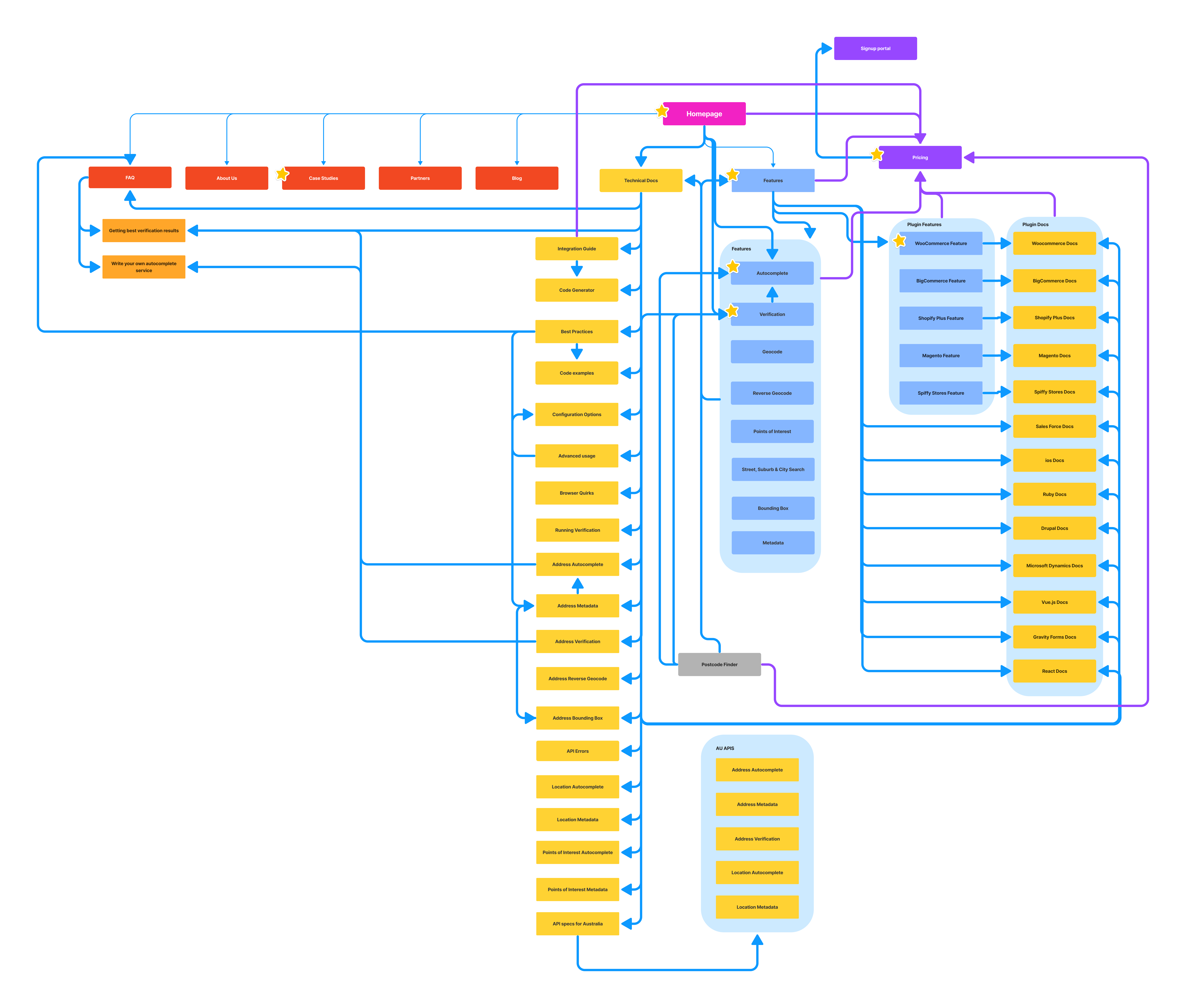
In order to know where we were going, we needed to know where we were. So, we did an audit of the current information architecture, looking at how different areas of the site go to the pricing page. With conversion being a key business need, we followed and documented where users were taken on that pathway through calls to action.

Once we had that clear overview of the site architecture, we quickly found space for potential improvements.
Research approach
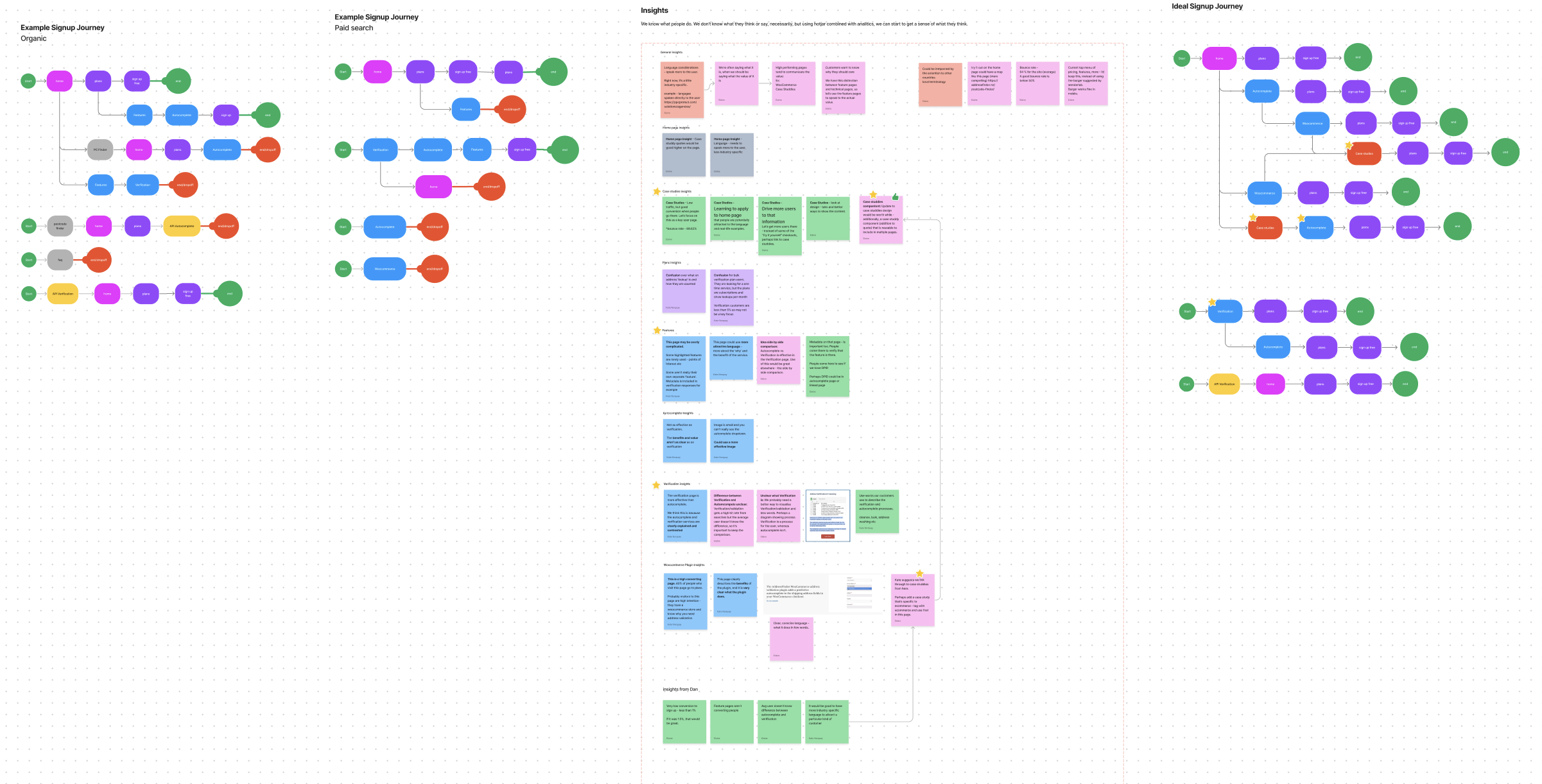
With a limited budget for user research, we had to make the most of the tools at our disposal. Abletech worked with the marketing team who had quantitative data from page analytics and also tools like hotjar. We also collaborated with the customer service team and product manager to get insights directly from customer feedback.
Simple and clear is key
From the User Research, we found insights related to:

Language - we need to use words our customers use to describe the verification and autocomplete processes. We also needed to give users a better understanding of Addressfinder features, linking directly to the value of what it does instead of what it specifically does

Too many features - Features page had too much information. All features were highlighted, many were rarely used and some weren’t entirely clear. Users weren’t engaging as well with a high drop-off rate and almost no conversion from that page. 
 
The verification page - This page is more effective than autocomplete. Based on customer feedback combined with hotjar, we think this is because the verification services are clearly explained and contrasted on that page.

Customer success stories - This was not as prominent and so had low traffic, but good conversion when visitors navigate there.

Unclear prioritisation of navigation items and an overload of options within the site information architecture.
Speak the customers' language
We then used those insights to inform our design requirements. Our changes to the information architecture and components as well as the value of each change:

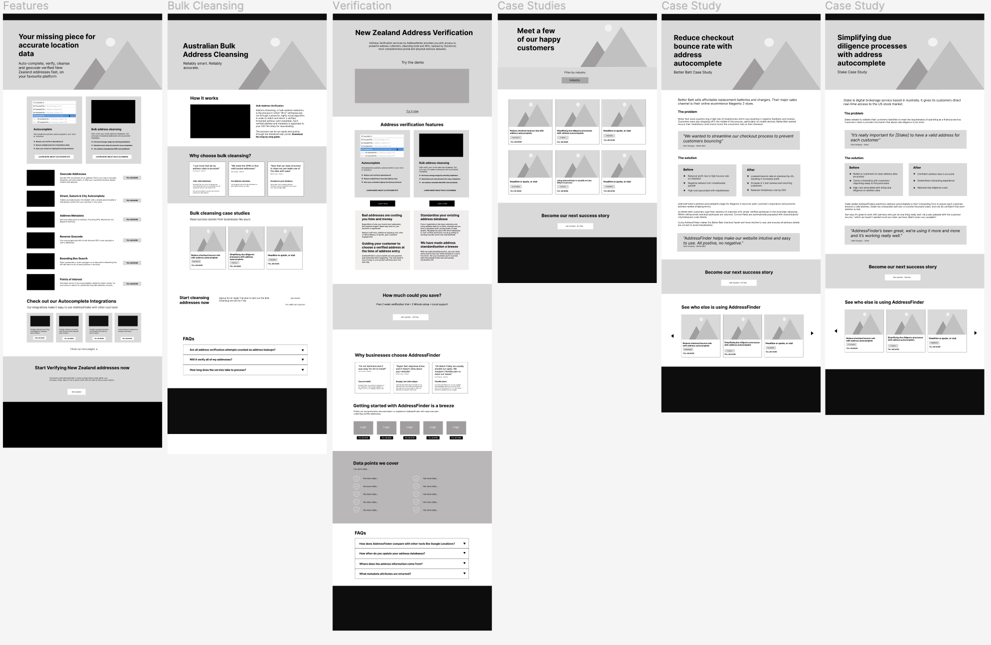
Case studies - Case studies was a high-performing page and users responded to the direct quotes. It also provided one of the clearest value proposition stories. To put it frankly, future customers want to know why they should care! We decided to pull this content out into components which could be used strategically in various parts of the site, speaking directly to the industry, plug-in or feature.

Industry pages - Business conversion was a high business priority for Addressfinder and was not enough priority in the previous design. Our team decided to allow filtration by industry in various parts of the site.
 
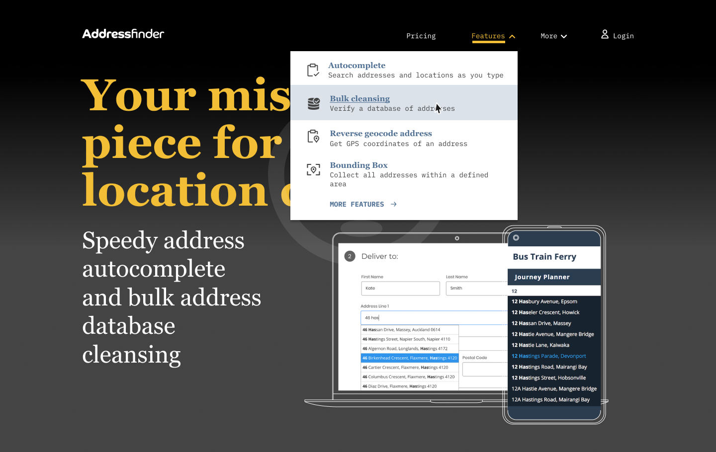
Feature prioritisation - We needed to highlight the most important features and make them front and centre, avoiding choice overload for the users. We prioritised four key features which had the clearest value for our current customers and pulled them into the drop-down navigation with iconography. Those were Autocomplete, Bulk Cleansing, Reverse geocode address, Autocomplete and Address metadata. The rest of the features were in a list, on another area of the site.

Understanding the features - Customer feedback told us many users don’t know the difference between some of the key features. A visual explanation of autocomplete and verification to better show rather than just tell the user. This helps them to understand what the key features actually are.
The final steps
After incorporating the insights into the wireframes and finally creating a design system, we passed everything off to the development team. We worked along side the developers as they build to the designs.

We also then moved onto the UI design for the product and internal interface for customers who had a purchased plan. To do this, we looked at the required states and components, adding these UI elements to the design system.
 The result
An increase in organic website traffic was the most notable result. The language update of core terms on the homepage for SEO affected the amount of traffic it captured. The total impact on traffic was 151% compared to the previous year, with a business plan signup rate increase of 195% and an agile plan signup rate increase of 295%.

Still after that Texas Chili recipe?

Get in touch!