Koha app

UX research, UX strategy & UI design
The challenge
The founders of a start up approached us with a simple idea to improve mahi of giving koha while strengthening community through convenience.

They had gone down the journey of design and a bit of build, but due to some illness within their team, they had to halt production. They also quickly realised that there was an opportunity to look at the user need from their solution and recrafted it with that user-lead foundation. They also knew that this community (being a part of it, themselves) has a range of unique considerations and there is not an easy way to fundraise online with those specific requirements.
My contributions
There are many solutions out there for exchanging funds, but I knew this one was something special and desperately needed user-lead data. And so, I embarked on a qualitative research approach, speaking to the users to find out what they would need to use a solution like this. 

From the start of this engagement, I created a strong bond and trust with this client. I worked closely with them to design the research methodology, creating our user research plan with stakeholder buy in before we began.
Giver journey PDF
Receiver journey PDF
A Kaupapa Māori research approach
Understanding the current user experience and identifying pain points, opportunities for improvement, and areas for innovation is the foundation of my UX design process and it's one of my biggest strengths. Through this research, I'm able to gain valuable insights into our users' behaviours, preferences, and needs, which we can use to inform our design decisions.

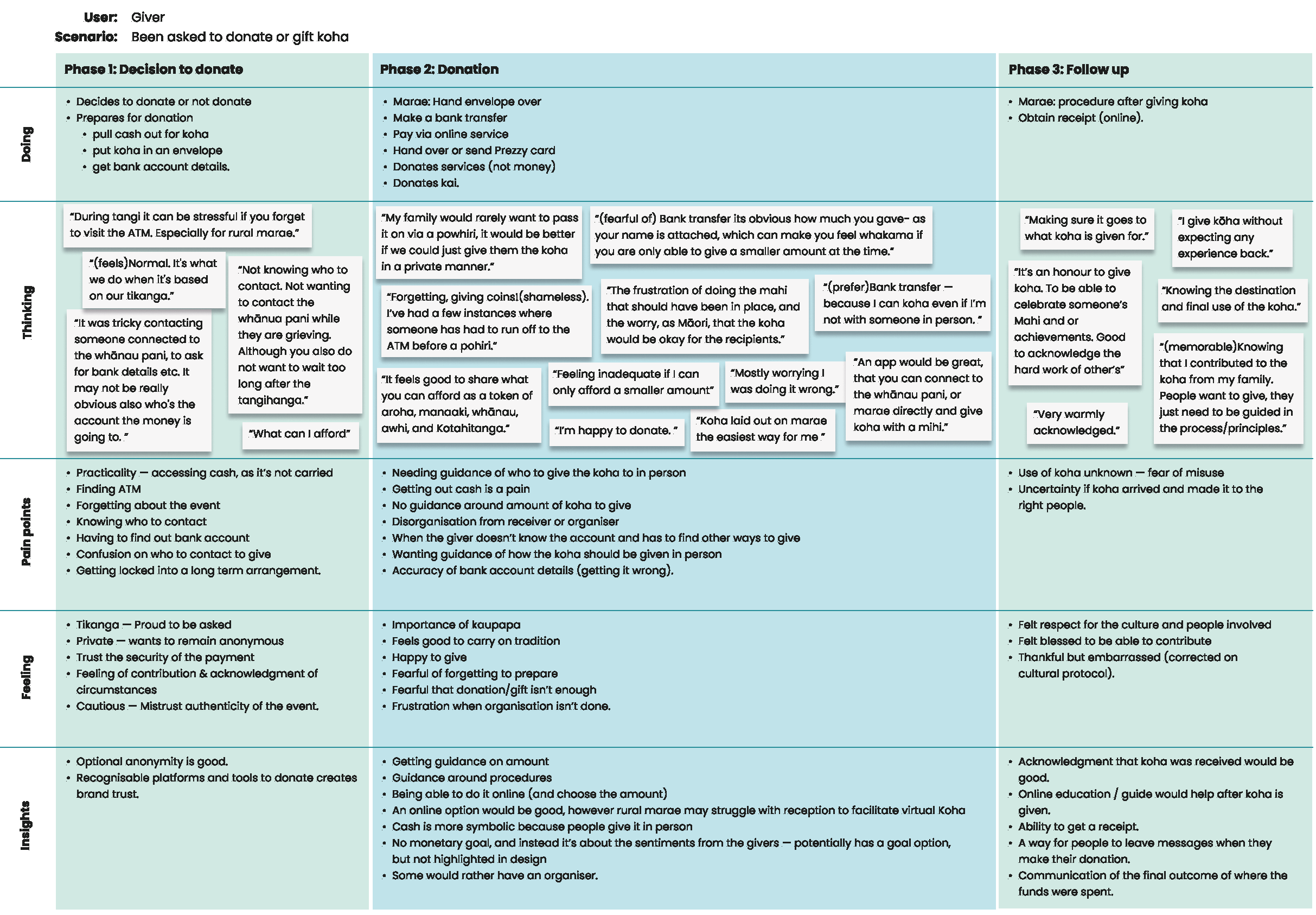
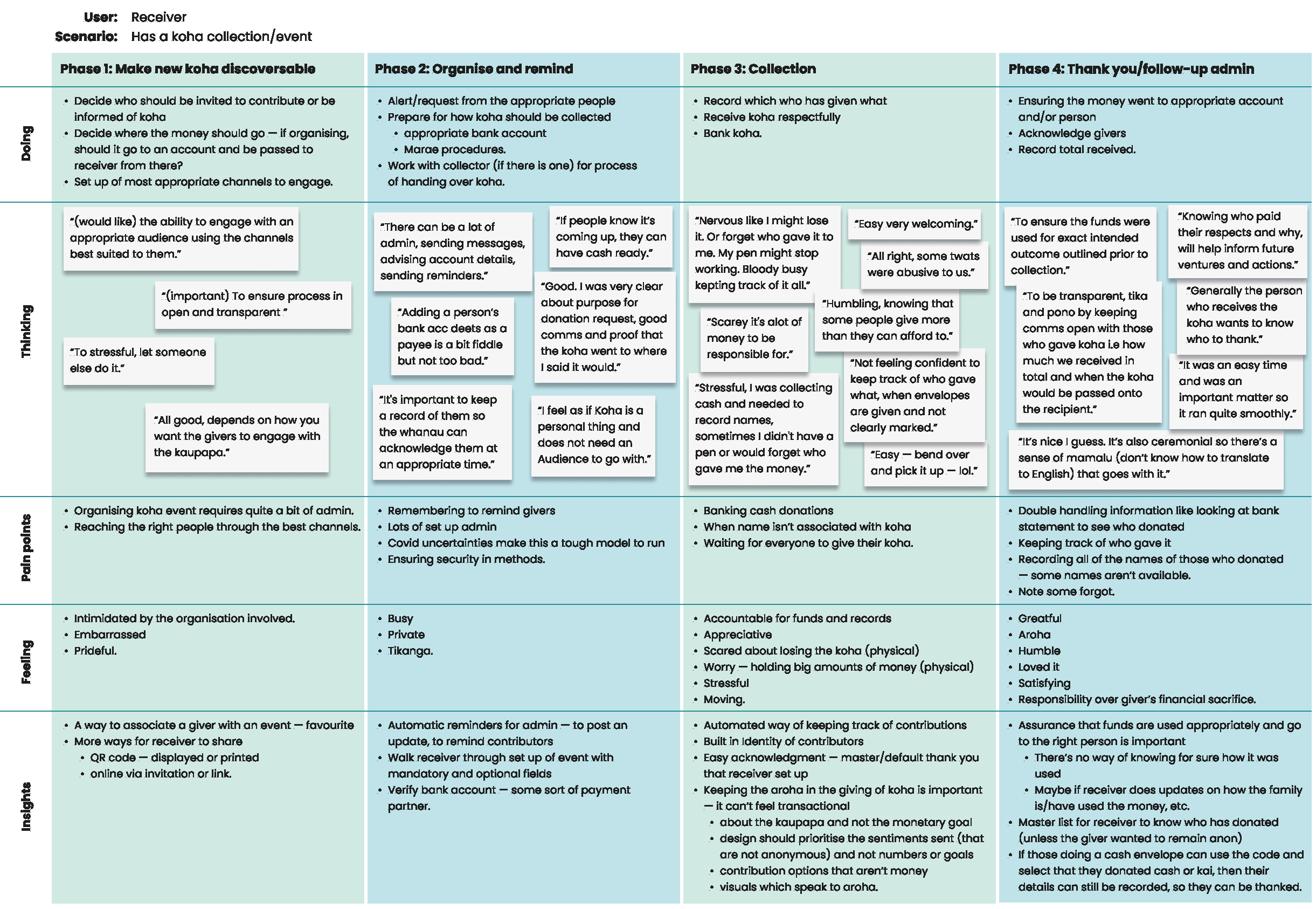
It was important to both us and our client to take a Kaupapa Māori research approach. Immediately, we felt the bond with in these communities and we wanted to hear all they had to say to give them the solution they needed. Working closely with the client, we conducted user interviews with hard-to-reach user groups and surveys to gather a large amount of qualitative research while being mindful of a refined budget and timeline.

The response we got was overwhelming - there was definitely a need in the market for this product and users knew what they wanted it to solve. 
Convenience with trust
Lead by me, our UX team synthesised the research and found some clear themes and user-driven needs we could incorporate into the application.

Synthesis involves taking the data we've collected from user research and transforming it into meaningful insights that can inform our design decisions. Through synthesis, we identify patterns, themes, and trends that help us understand our users' needs and preferences. This process enables us to prioritise design features and functionalities based on the most significant impact they will have on the user experience. 

A few of the themes we found were:

Guidance around what to give and other procedures.
Convenience of options to donate.
Group contribution - The giving is community-driven, which means many give as part of a family or group.
Acknowledgement of receipt is important.
Trust that it’s an authentic fundraising event.
Fast event set up, fast donation.
Automated way of keeping a record of funds given/received.Now, we knew much more about our user needs and we had a clear idea of what they needed out of this application. 
Crafting future of koha
Crafting the future state is the ultimate goal of the UX design process. It involves creating a design that not only meets the current needs of our users but also anticipates their future needs and preferences.

With this application being half built, the future state design was a tricky one. We had to be careful and deliberate about what features we would take forward, what we would throw out and what we needed to fix. Working heavily with business analysts and technical leads, we had to pick apart the application carefully. At the end of this process, we had an idea of and could begin to design for the MVP.

We then moved on to design the wireframes. I was able to redesign the application with the user considerations incorporated, making it a much more effective application, which specifically addressed the need in the market. We also created artefacts like touchpoint diagrams, and eventually the updated design system (building upon the original system).
The result
We've had an outstanding collaboration experience, with a user-lead focus from the start. Not only is the whole team proud of the journey we've gone on, I personally had the opportunity to form a lasting partnership with this client which will hopefully lead to the opportunity to work together in the future.

We have yet to launch the MVP and are looking forward to seeing it go live.